


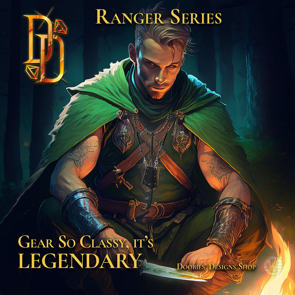
Ranger Series
Project Overview
The Ranger Series is a self-initiated branding and visual exploration project designed to showcase my skills in digital compositing, product photography, visual storytelling, and brand development. The goal was to build a cohesive identity that merges handcrafted products with stylized fantasy-inspired artwork, highlighting my ability to create immersive visuals and consistent brand systems across multiple touchpoints.

Design Objectives
-
Develop a distinctive visual identity that blends real product photography with fantasy-inspired digital artwork.
-
Create clear, consistent brand messaging through typography, color, composition, and storytelling elements.
-
Showcase my ability to craft a cohesive aesthetic across banners, posters, product scenes, and lore elements.
-
Demonstrate advanced digital design skills, including masking, lighting, compositing, and atmosphere creation.
-
Build a portfolio-ready case study that highlights professional decision-making and creative strategy.
Inspiration & Visual Direction
The project draws inspiration from:
-
Fantasy concept art
-
Adventure game UI design
-
Heroic character archetypes
-
Natural textures (stone, metal, wood, firelight)
-
Cinematic poster lighting
-
Treasure and artifact presentation in RPGs
The creative direction focuses on high-contrast lighting, rich color palettes, and story-driven compositions that elevate everyday objects into visually compelling artifacts.
Visual Style Choices
To differentiate this series, I intentionally blended real-world product photography with fantasy-styled environments. This approach allowed me to:
1. Create a strong visual hierarchy
Warm highlights and cool shadows were used to draw focus toward the product, while secondary elements—such as characters, treasure chests, and forest environments—reinforce theme without distracting from the central subject.
2. Align the aesthetic with narrative identity
Each composition is designed to feel like a moment of discovery. Atmospheric effects (fog, embers, magical glow) were added to create depth, while maintaining realism through careful masking and lighting adjustments.
3. Maintain brand cohesion across assets
Consistent typography, color grading, framing, and emblem/logo placement ensure that all pieces—posters, banners, scrolls, and item displays—feel part of the same world and visual language.

Onyx

Mossy Agate
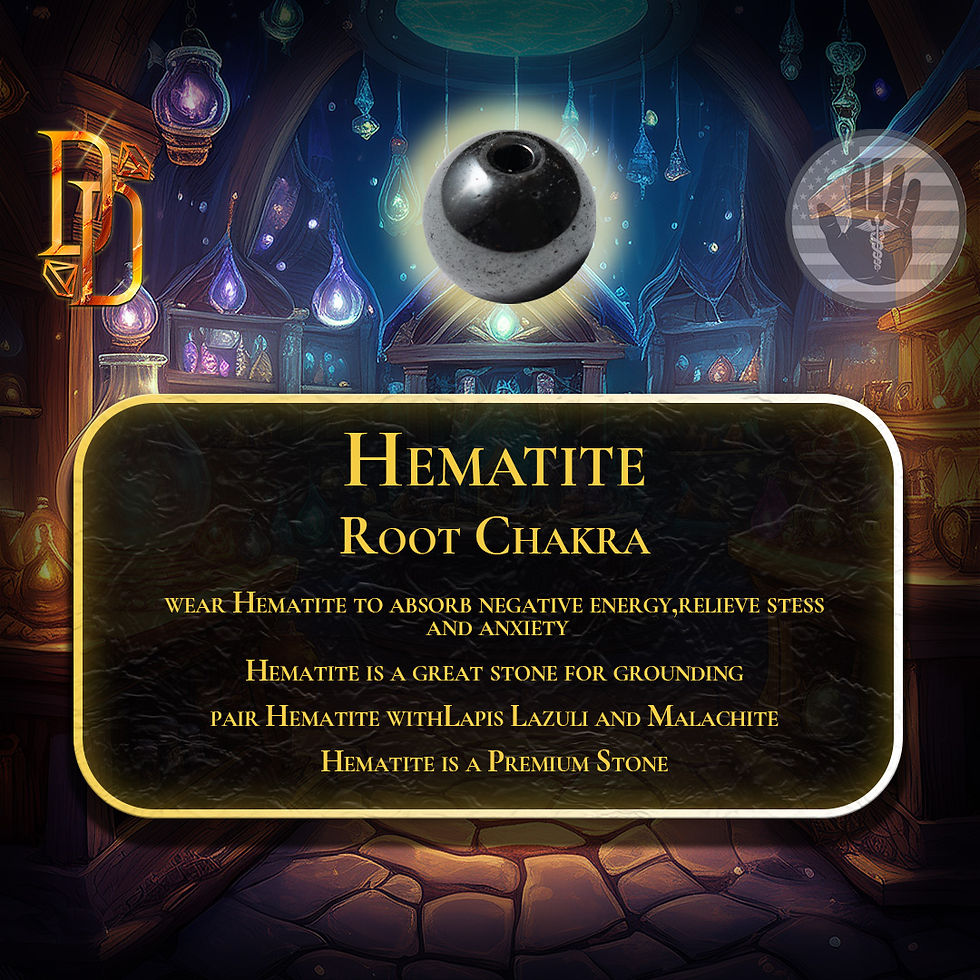
Hematite
Onyx
Tools & Software
-
Adobe Photoshop — compositing, masking, lighting, color grading, and atmospheric effects.
-
Adobe Illustrator — typographic layout, logo refinements, vector elements, and clean brand assets.
-
Digital Photography Setup — DSLR/phone photography with controlled lighting for clean source images.
-
Drawing Tablet — hand-refining textures, details, and lighting passes.

Ranger Sling

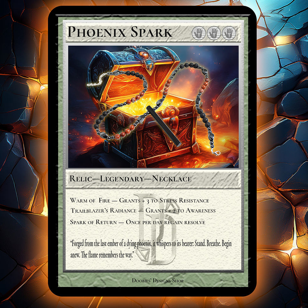
Phoenix Spark
Ranger Sling
Process & Workflow
1. Concept Development
I began by defining the tone and narrative direction for the Ranger Series. I created moodboards capturing lighting, color palettes, fantasy influences, and atmospheric references.
I photographed each product under consistent lighting conditions to ensure clean integration into digital environments. Additional textures and backgrounds were sourced or digitally painted as needed.
2. Photography & Asset Collection
Products were masked and integrated into the chosen environments. Camera angles, scale, and perspective were adjusted to match the surrounding scene.
3. Base Composition
4. Lighting & Color Grading
I applied cinematic lighting—high contrast, warm highlights, and cool ambient tones—to merge the product seamlessly into the artwork. Color grading unified the scene and emphasized the focal point.
Elements such as dust particles, fog, embers, and magical glow were added to enhance mood and depth. Each effect was layered carefully to maintain realism.
5. Detailing & Atmosphere
Title treatments were created with consistent font choices, metallic embossing styles, and structured hierarchy. Logos and text placements were adjusted to reinforce the brand identity without overpowering the artwork.
6. Typography & Branding
7. Final Polish
Sharpening, edge cleanup, and export formatting ensured the final images were clean, professional, and ready for presentation.

Dagger Sling Lore

Phoenix Spark Lore
Dagger Sling Lore
Final Deliverables
-
Hero Branding Poster (Ranger Character Key Art)
-
Series Introduction Banner
-
Product Display Compositions (Loot Chest, Dagger Sling, Phoenix Spark)
-
Lore Scroll Concept Pieces
-
Digital Tool Overview Section
-
Thematic Supporting Graphics
These pieces work together to demonstrate a cohesive design system built around fantasy-inspired branding and immersive visual storytelling.

Dagger Sling

Phoenix Spark
Dagger Sling
Key Takeaways
This project strengthened my skills in:
-
Advanced digital compositing
-
Art direction and thematic cohesion
-
Story-driven brand identity
-
Creative problem-solving in visual presentation
-
High-level Photoshop workflows
-
Integrating real-world photography with stylized digital art
The Ranger Series showcases my ability to create polished, imaginative visuals grounded in professional design principles. It represents my approach to building worlds, enhancing products, and translating creative concepts into complete branding systems.

Dagger Sling
Phoenix Spark
Dagger Sling